
Probable Futures Web Platform
Probable Futures approached Postlight with the considerable task of building an online tool to help the public understand how to live in a world with changing climate scenarios. We created a platform that communicates the consequences of climate warming through interactive maps, charts and a beautiful and compelling storytelling experience. This project was a true collaboration for me. I worked with my product manager and engineers at Postlight but also worked seamlessly with outside partners like scientists from Woodwell Climate Research Center and designers from Moth design to create the final product.
I came on to this project six months after kickoff. The client wanted to restart the project with a new design team, so I was tapped to join a new design team with Moth design. First, we tagged teamed the strategy deck showing personas, user journey, site map, wireframes and auxiliary ideas to support the organization. Next, I moved on to wireframes and flows for the interactive maps while also building out the hi-fi designs for the About section and a generic content template for WordPress. I also co-led three rounds of user testing throughout the project with the head of Moth design. I also was the liaison between the content and design team.
WHAT I DID:
Product Strategy, UX, UI, Visual Design, User Testing, Design QA, Content Consultant, Interactive map designROLE:
Lead Product designerAGENCY & Year:
Postlight 2020-2021Links:
WEb Platform
Heat Interactive MapFeatured On:
Bloomberg Green
Site InspireAwards:
Gold and Silver Anthem Awards (from the webbies)
Platform Design
Taking inspiration from books and movies, we set about to create a layered but straightforward experience. In this experience, we wanted users to slow down and digest foundational earth science concepts to help them understand our warming world. We purposely moved away from “snackable” content and embraced more long-form and purposeful web patterns. We did this so the user could take their time and sit with the content allowing them room to digest and sit with the content. We wanted the experience to be more like a book than a website.

Homepage of the platform. The site was a responsive website.

Wireframes for the Heat Section

Heat Section of the platform. The page on the right show how footnotes/definitions would work on the site.

Left: About Section. Right: showing a slider map in the Heat Section

Mobile versions of the Heat Section and the About Section
Interactive Map Design
The interactive map is one of the most critical parts of the platform. The map lets visitors imagine what the world will be like at various degrees of warming. I stripped back the complexity of the map to allow all users to explore, digest and absorb data and facts. The user experience was left open so visitors could decide how to guide their path through the map. They decided whether they wanted to read localized climate stories, zoom in to see the detailed data or move through the degrees of warming to see how the earth would be affected. I learned a lot about interactive map design while on this project and wrote a great article about my learnings.

Wireframes of main map

About and Vignettes wireframes
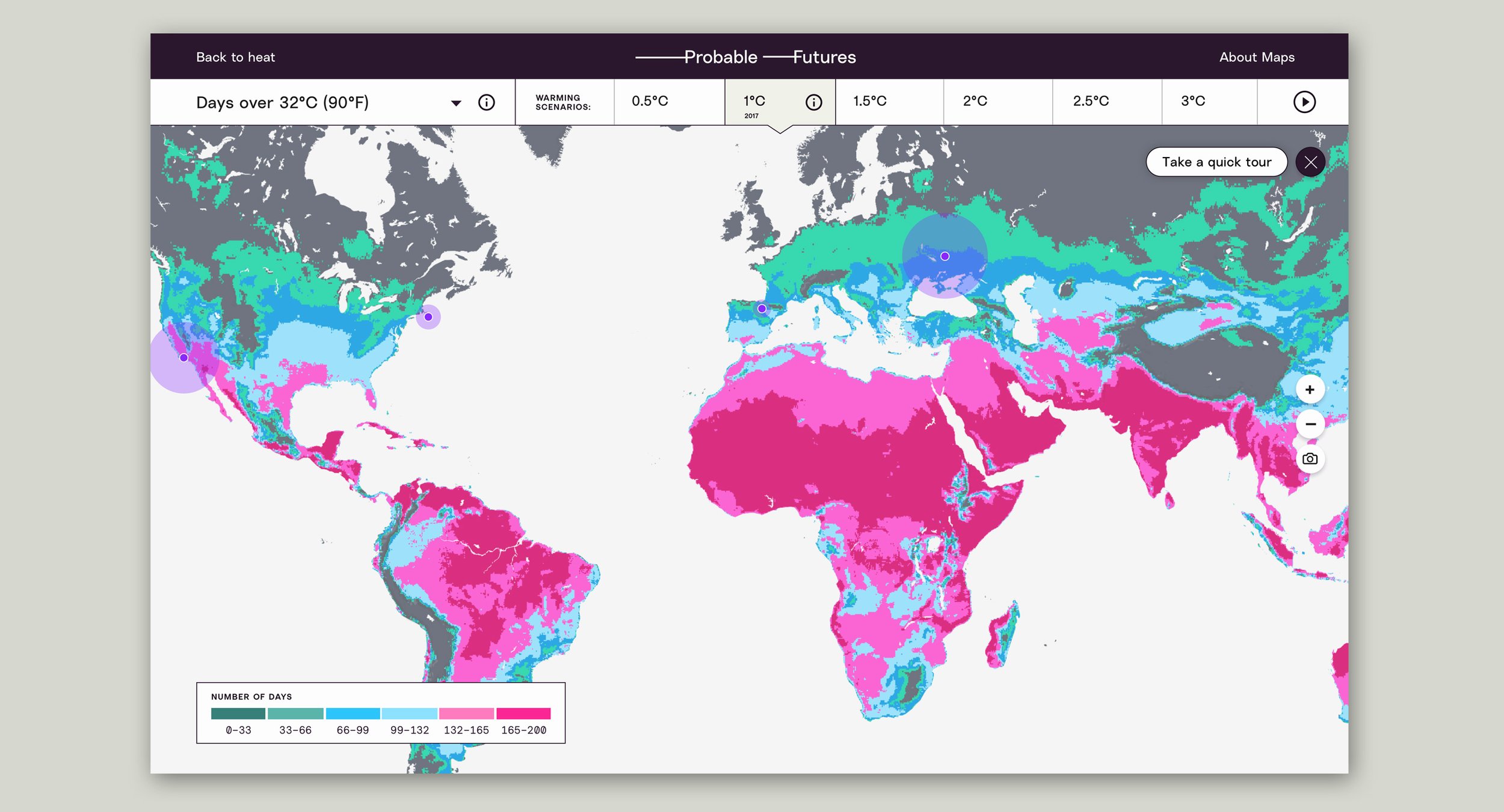
Interactive map interface

Degrees of warming info drawer open

Zoomed in view of the map reveals the data squares that on hover/click reveal the data for that area

User clicks on the purple dots that take the user to a vignette. Vignettes can be stories, videos, audio, quotes and data explainations.

About the maps section. Users can learn about the data behind the maps, how our maps came together and also how to use the maps.

Mobile views of the maps.
User Testing
From the beginning of the project, I championed doing user testing. User testing is one of the quickest and simplest ways to see from the user’s point of view what is working or not working. For this reason, we tested after the strategy, wireframe and hi-fi phases of our project to build in feedback loops from the user to make sure we were on the right path. We got a lot of great insights from these testing sessions. See below for a few of the things we learned.

Navigation bar updates to map
During our second round of user testing on the interactive maps, we got feedback from a few users that the navigation at the bottom of the screen wasn’t intuitive. They were confused about what they could do on the map. They had to spend a bit of time looking around to find out how they could change between the degrees of warming. Taking that feedback, we moved the navigation to the top of the map. It was a simple fix but made a big difference in users’ understanding of one of the critical features of the map.

Map Colors
When testing the first iterations of the interactive map, we found users had a hard time seeing the change between the degrees of warming maps. Also, users were a bit put off with our yellow, orange and red color palette. They felt it was too jarring and alarming, making them not want to explore the map. For this reason, I explored color palettes to highlight the changing data better and to be more visually appealing. I also wanted to make the color palette accessible to red/green and blue/yellow color-blind users. Finally, we decided to eliminate the blurring between the colors to make the distinction between the bins more noticeable and starkly show the data.