Probable Futures Climate visualizations tool
After working on the Probable Future platform, I was tapped to be the sole designer for the Probable Futures Pro application. Probable Futures wanted to take the data and interactive maps we created for the web platform and create a mapping application. They wanted to do this so outside users could upload whatever data they wanted and overlay it on the Probable Futures maps. Then the users could filter, refine and export the combined data for their uses. However, at the start of the project, we found that users couldn’t fully grasp how to use the application without interacting with it. We decided to run the project as an MVP to get the tool into users’ hands as soon as possible. The application is now in alpha and being used by scientists, consultants and journalists.
WHAT I DID:
Concepting + Product Strategy, UX, UI, Visual Design, Design QAROLE:
Lead Product designerProject Duration:
4 months
Application Design
The engineering team had built out a functioning proof of concept on the Kepler.gl platform when I came on to the project. Next, I partnered with my product manager. We identified functionality that would be useful for our users and removed all the extra functionality not needed by our users. Next, I streamed-line and cleaned up the UI, making it intuitive for our less technical audience. Then I designed and added new features that our audience needed. Finally, I created a visual theme to make the entire application be part of the Probable Futures brand ecosystem.
Wireframes (1 of 2)
Wireframes (2 of 2)
Landing screen giving overview of the application and documents to help you get started
Projects tab where you can create a new project and see all of your other projects
Dataset tab where you can upload datasets and see which datasets you have already uploaded
Dashboard
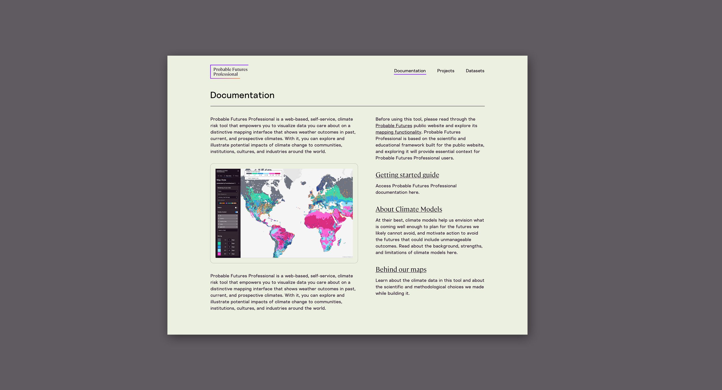
Creating the application, we knew we needed a dashboard to allow users to start a project and understand what the Probable Futures Pro tool could do. So we created a simple dashboard introducing the application to users and supplying tutorials, documentation and data sources. It also was a destination for creating and interacting with your projects and seeing any uploaded data from your team.
Create project and upload dataset
Data panel - user can see what data is used for the map and edit what degree of warming is shown along with the range of the Probable Futures data
Map Style panel - user can edit how their data is rendered, tooltip content and binning of the Probable Futures data
Filter panel - user can filter their data
Expanded key with Probable Futures data and the user’s data


