
MTA Communications Platform
MTA Mercury is a messaging platform that I helped create for the MTA to power all of their communication channels: social media, email, websites, apps, and over 50,000 digital screens. This platform powers communication for all branches of the MTA: subway, busses, Long Island Rail Road and Metro-North Railroad. Before Mercury, the MTA had an assortment of workflows and tools that varied across teams and divisions. It was outdated and cobbled together from multiple systems that didn’t talk to one another, which led to miscommunications and inefficiencies when messaging the public. So my company was brought in to create one messaging platform for all the teams and branches to use.
My team and I did extensive research, user interviews, and site visits with the various MTA teams and branches to understand their workflows, tools, and specific pain points for this project. Once we had a solid understanding of the goals and pain points, our design team began to work on parallel tracks for each part of the Mercury platform: Alerts, Planned Work, Campaigns, Screen Management. For these tracks of work, I oversaw a team of 4-5 designers while also working on these tracks of work. We worked quickly and iteratively showing and user testing design work with the internal MTA teams to make sure what we were building would meet their needs while removing friction.
Stats within the first few months of launching mercury:
3,401 service incidents with 17,131 alerts sent
46 million+ emails sent to rider's inboxes & 3,740 tweets
Within just the month of June 2020, 935 screen alerts totaling 58,605 messages shown on individual screens
Mercury reached 1,750 screens at over 200 stations and 99.99% uptime in June 2020
WHAT I DID:
Concepting + Product Strategy, UX, UI, Visual Design, User Testing, Design QAROLE:
Lead Product designerProject Duration:
1 year
Alerts
The alerts team at the MTA writes and deploys all the emergency alerts for the whole system when something goes awry. The goal of this team is to get out the best information as quickly as possible to help the public navigate around any problems. The application they had before had a cluttered UI and was hard, confusing and time consuming to use. So we streamlined the user flow and created an intuitive UI that followed how the team builds the messages, and we implemented a shortcut command to bring in stations and train lines quickly. I made site visits and a few rounds of user testing to make sure the interface would work for the team.

Alerts overview

Compose alert (1 of 2)

Compose alert (2 of 2)

Compose alerts with affect stations added to it

Alert detail page after alert has been composed and sent.
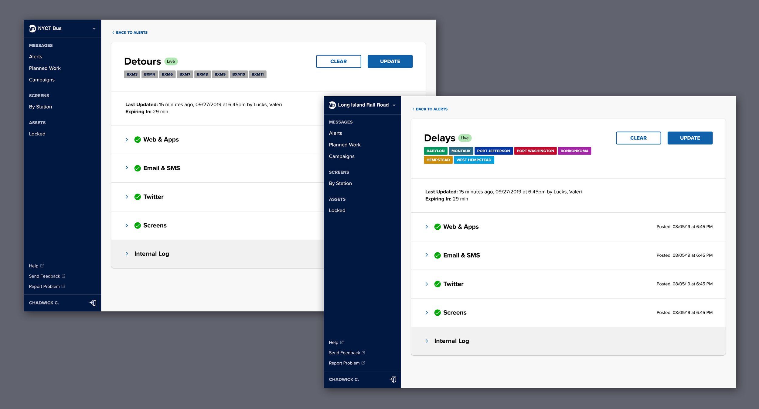
How the detail screen looks for Busses and LIRR
Cleared alerts
Planned Work
The planned work had different goals than the alert team. This team works at a much slower and more deliberate pace than the alerts team. They spend 1-2 weeks writing and figuring out the best paths around the station and line closures and how to deliver those messages. Planned work messages are more complicated, detailed and more nuanced than alert messages; therefore, the interface had to work harder to meet all the team needs while offering flexibility and optionality. For this team, I also did site visits and user testing to make sure what we were delivering would meet the team’s goals.

Left: Planned work overview screen. Right: Planned Work Drafts
Planned Work Cleared

Compose Planned Work (1 of 2)

Compose Planned Work (2 of 2)

Planned Work detail page after it has been composed and sent.
Campaigns
The campaign teams need to set and deploy MTA ad and marketing campaigns to various screens throughout the MTA ecosystem. The campaign team needed to upload the ad or pull it from the ad library, choosing screen type, duration, and where the screens were deployed. We designed an interface where they could easily see how the ad would look and deploy a dashboard to get a high-level view of all the campaigns quickly.

Campaigns overview

Campaigns compose (1 of 2)

Campaigns compose (2 of 2)

Screen Management
Another critical part of the Mercury platform was to allow teams to see what was on various screens in the system and what type of screens lived in each station. My team and I devised an intuitive and straightforward interface that quickly surfaced a high-level view of the stations with screens and allowed a deeper dive into individual screens. We also created a flow to choose and lock specific content to a screen.

Screens Landing page.

Screens overview

Screens in a individual station

Screens detail. Shows information about the screen, what is scheduled for the screen and allows the user to lock the screen.
User Testing
User testing was an integral part of this project. We initially did user testing with the alerts team as a way of testing the designs, but also to test the first engineering build of the product. That user testing session proved the design and the product worked well for the team, but it also built trust and let the MTA team see the value of the product we were making. The MTA could see what we were building would work for them, and they asked for user testing on every track of work we were doing. We ended up testing alerts, planned work, campaigns, durations and built a great partnership with the MTA. I am a big fan of user testing and wrote an excellent article for Postlight’s blog.